Wednesday, 19 September 2012

nic and pip's positano wedding


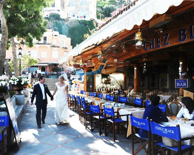
Our very dear friends Nic and Pip were recently married in magical Positano (insert deep sigh of envy here), and we had the pleasure of designing and printing their beautiful flat-print wedding invitations and reply cards. Featuring a custom-designed lemon tree and printed in striking cobalt blue and yellow, Nic and Pip wanted their stationery to reflect the incredible Italian setting.

We were so happy when Nic emailed through these gorgeous photos of their day, along with a very sweet testimonial on what it was like working with us:

"Getting married in Italy was always going to be a challenge, and pulling together each and every detail required patience, perseverance (and the help of some translators!). To our delight and immense gratitude, Sarah and the Simplethings Press team made sure our invitations were on time and perfect. We had a clear idea of what we wanted and on the first go Sarah's concept was EXACTLY what we envisioned - she caught the theme of our wedding far better than we ever hoped. Thank you so much for our beautiful wedding invitations!" ~ Nic & Pip Purdue

Thanks so much Mr and Mrs Purdue! It was such a pleasure to design for such dear friends, and congratulations on pulling off the perfect Positano wedding. We only wish we could have made it over to partake in some limoncello with you! xxx

Saturday, 4 August 2012

pantone tarts by emilie de griottes


Isn't this gorgeous? I just stumbled upon the amazing work of French food designer Emilie de Griotte, which includes her incredible pastry creations of Pantone colours. As a lover of all things Pantone, this is right up my alley.

So pretty to look at and certainly too pretty to eat.

Her site is full of beautiful food photography - head on over for a look.

Tuesday, 3 July 2012

sugarlove masterclass: the invitation

We've been dying to share this great project we recently finished working on, for the lovely Leigh Taylor and Bradley Patrick of SugarLove Weddings (Bradley in fact photographed the wedding of my husband and I back in January 2009, so we are already huge fans of his amazing work).

SugarLove approached us to create a very special letterpress invitation for their upcoming SugarLove Masterclass event, a world-first leading photography workshop that aims to inspire and motivate creative talents in the photographic industry.

Together with the super talented Alicia Larriera at Form Over Function, we created this beautiful one-colour letterpress invitation, printed in a perfect shade of coffee (Pantone 7504) on our pillowy-soft ivory cotton stock, and paired with a cotton envelope lined with linen fabric. Each envelope featured calligraphy in chocolate ink to complete the look. We also printed some lovely tags to be used as placesettings for the lucky Masterclass students.


Bradley, who has photographed the likes of Elizabeth Taylor, Morgan Freeman, Nicole Kidman and Rose Byrne, will be sharing his 18 years of experience for the very first time in this exclusive two-day event (July 7 and 8 in Sydney), with red carpet opening night drinks on July 6.

For emerging professionals and lovers of photography, this is a fantastic opportunity to see a master of the trade at work - and it's not too late to purchase a ticket. Email info@sugarlovepictures.com or call (02) 9360 1127 for bookings and enquiries.

We've got a couple of other bits and pieces from the Masterclass project to show you, including some gorgeous letterpress gift tags that we printed for the cocktail party gift bags, but we'll wait until after the big event to reveal those!

Thanks so much Leigh and Bradley for asking us to be part of this very special event - it was such a pleasure to work with you xx

Design concept and calligraphy - Alicia Larriera at Form Over Function
Design, letterpress printing and production - Simplethings Press

Saturday, 23 June 2012

homemade sourdough bread


Lately, in between bouts of letterpress printing, I've been somewhat fixated with making bread. We have a bit of an addiction to sourdough bread in this house, and quite happily part with $6 a loaf at our local baker a bit too regularly.

After one week, when I realised we had somehow managed to go through 5 loaves (I think we had hungry visitors that week... yes, that would be it, ahem...) totalling $30 a week just for bread, I thought instead of taking out a second mortgage to fund our sourdough habit, perhaps I should learn how to bake something similar myself at home.

So I ventured, not so bravely, into the world of sourdough starters. Which all seems rather daunting when you first attempt to get your head around it, but once you get started is really just a matter of remembering to 'feed' the starter every day.

I followed the instructions here to create my starter (read down the page a bit to get the recipe)

To bake the actual bread, I use this recipe:

My Sourdough (With a Bit of Help) Bread

150gm of sourdough starter
4 cups (or so) of high grade plain flour
2 cups of lukewarm water
1 tsp commercial yeast
1 tsp salt

(Yes, adding the yeast is definitely cheating! Normally yeast is not added to sourdough recipes as the starter itself is supposed to do the job... but after some experimenting, I find I get a higher, bigger and fuller loaf if I add a small amount of yeast to the mix - it gives the starter a bit of a helping hand, I guess. Sourdough purists would probably tie me to a stake and burn me at dawn for this, but whatever works I say.)

I throw it all into the Kitchenaid mixer and let it come together for a few minutes. Keep adding flour if the dough is too wet - you want it to come together into one mass, just sticking slightly at the bottom of the mixing bowl.

Once you've got your ball of dough, plop it into an oiled bowl (a big one) to rise overnight, and cover it with a tea towel.

The next morning, preheat the oven to a really high temp - about 220 degrees. Grab a medium-sized pot - a heavy bottomed Le Creuset-type cast iron pot is ideal, but lately I've been using a regular old Scanpan saucepan and the results are just as good. The only essential thing is the pot must have a lid.

Put the pot with lid into the oven to heat up for about 30 mins - this part is important as the pot must be really hot before you put the dough in.

While the oven and pot are heating up, pull the risen mass of dough out of the bowl and form it into a rough ball shape.

Once the pot is hot, take it out of the oven and plop the ball of dough straight in. Score the top of the dough with a cross, put the lid back on the pot, and put the pot back into the oven.

Bake the loaf for 30 mins with the lid on, then remove the lid and cook for another 10 mins to brown the top. Loaf is cooked when you tap the bottom and it sounds hollow.

And that's it - perfect bread! Not as hard as it would seem. Admittedly mine doesn't have as much of a sour taste as the local baker's, but the texture is great and the taste is pretty darn good (see evidence above of small child enjoying attacking bread).

Wednesday, 13 June 2012

recent work : christina & rowan


Well, it's been a long time between posts here on the blog, thanks to being busier than ever in the studio the last couple of months. Our dear old press has been cranking out impressions at maximum capacity. But the good news is we will have plenty of gorgeous letterpress projects to show you over the coming months.

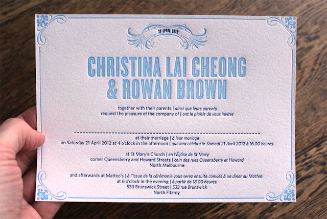
Here is just one of the many lovely wedding stationery suites we've had the pleasure of working on recently. Christina and Rowan came to us wanting a custom design with a feel of vintage cigar box artwork, with its flourishes, borders and corner fills. The invitation also needed to be bilingual, in both English and French.

And here's the end result, letterpress-printed in Christina and Rowan's wedding colours of sky blue and navy. We printed the invitation in 2 colour letterpress, and the coordinating reply/wishing well card and thank you card in just 1 colour (a great way to keep costs down when printing letterpress). All items are printed on pillowy-soft, 100% cotton stock in ivory, 300gsm.

We love working on custom designs for such delightful couples! Thanks Christina and Rowan for allowing us to be part of your special day, it was such a pleasure x

Monday, 23 April 2012

recent work : emma and andrew


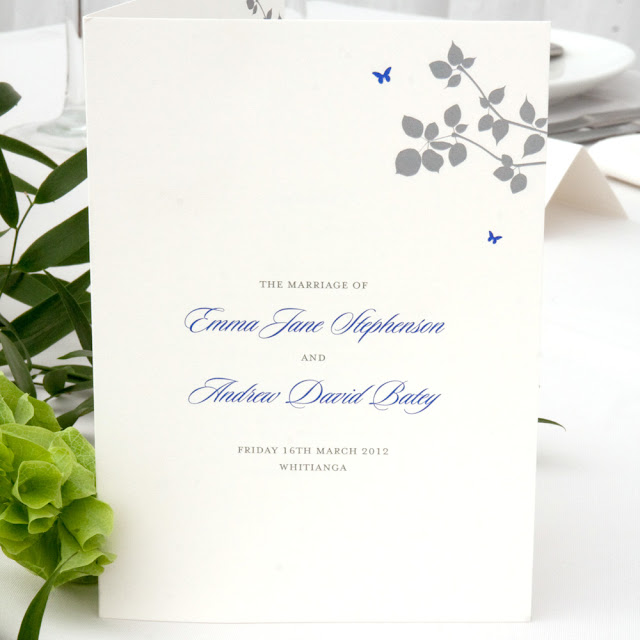
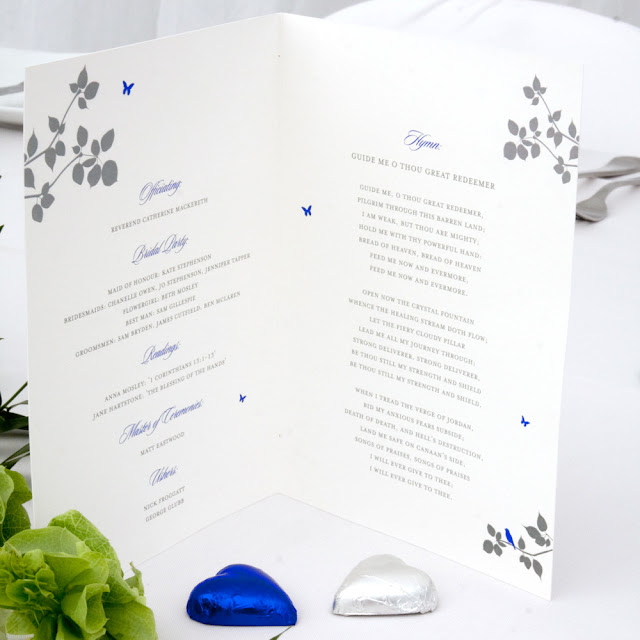
Some snaps above sent through by one of our gorgeous Kiwi brides, Emma. In addition to their wedding invitations, we created the 'day of' stationery for Emma and Andrew's 16 March wedding, including order of service cards, table signs (named after special streets and places significant to the couple) and placecards, all customised to match their wedding colours of dove grey and sapphire blue. Emma and Andrew chose our Jardin design, in flat printing.

We love the subtlety of the grey paired with the bright pop of blue - so pretty.

Congratulations Emma and Andrew on your marriage, and thanks so much for the lovely photos. We always get a thrill out of seeing our stationery in place on the big day! x

Sunday, 15 April 2012

Loving the look of this clever and beautifully-illustrated book by graphic designer Vahram Muratyan, a visual homage to two of the world's great cities.

In the contest between macarons vs cupcakes - hmm, it's a close one... but for me I think les macarons must win.


Images from Paris vs New York: A Tally of Two Cities, by Vahram Muratyan.


Wednesday, 28 March 2012

thanks polka dot bride!


It has been awhile between posts here on the blog... busy times in the studio of late!

But we are very excited today to be featured on the fabulous Polka Dot Wisdom blog, with our 9 tips for gorgeous wedding stationery. Brides-to-be, head over to read our tips about how to get the best out of your wedding stationery budget.

Thanks again Polka Dot Bride - it's such a thrill to be featured on one of our favourite wedding blogs! xx

p.s. Normal blog posting shall resume again soon... once we get through our crazy studio workload! We do love being busy bees though, and have some beautiful stationery to show you over the coming weeks/months.

Wednesday, 29 February 2012

recent work : melanie & stuart

It's been a busy few weeks in the studio, and as a result we are bit behind in our blogging! But today we thought we'd have a little break to show you a fun custom design that we created a few months ago for one of our lovely wedding couples. Melanie and Stuart are both scientists who wanted a science-themed design for their wedding stationery. Melanie liked the idea of hearts spilling out of a test-tube - so we took her idea and ran with it! The result is a quirky, one-of-a-kind invitation that reflects their personalities and shared love of science. We created a full set of stationery pieces, including invitation, matching personalised mailing labels, rsvp card and thank you card - all digitally printed in cherry red and dove grey onto our soft, ivory stock, and paired with matching ivory envelopes.


Thanks Melanie and Stuart for choosing us for your stationery - this was such a fun design to create. We hope you had an amazing day! x


Wednesday, 22 February 2012

recent work : katie & christopher

We had so much fun recently, designing and printing these letterpress wedding invitations for Katie and Christopher. They chose a stunning colour palette of sunshine yellow paired with a matte gold for the wording, and we love the end result - so perfect and summery for their February wedding!


Simple, pretty and oh so elegant. If you're wondering, the design is our ever popular Lovebirds, printed in two colour letterpress.

Congratulations Katie and Christopher! It was such a pleasure working on your stationery and we hope it set the scene for the most special of days. x


Friday, 10 February 2012

a busy day in the studio...

We've been hard at work today printing a three-piece letterpress wedding stationery suite for another of our lovely couples, Hayley and Hamish.

Here are a few snaps of the press (and Sarah) in action...


Time now to relax with a glass of wine! Hope you are all enjoying the weekend x